
Your Client-Ready Mockup Checklist
- Miriam Rowe

- Oct 9, 2025
- 3 min read
Simple optimizations that make your surface designs look professional and ready to impress

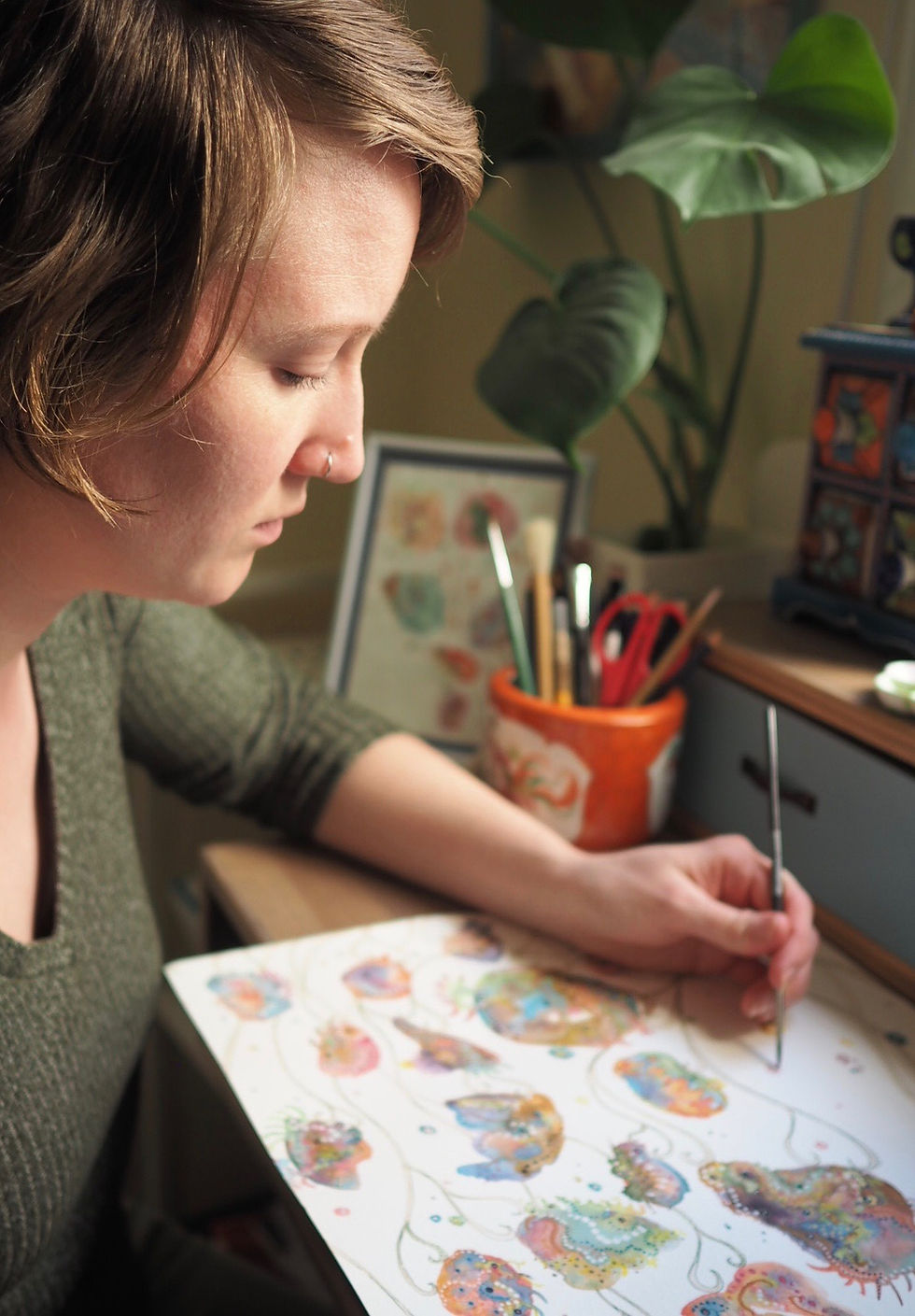
Mockups are more than just a pretty way to display your designs—they’re a storytelling tool. Used well, they help clients see your work in context, guide purchasing decisions, and even help you refine colors and scale before production.
Whether you’re preparing for a licensing pitch, updating your Etsy shop, or entering a Spoonflower challenge, here’s a checklist to help you make every mockup work harder for your portfolio:
1. Choose Intentionally
Not every design suits every scene, and that’s the beauty of it:
Does this mockup complement the mood or tone of your design?
Is the setting relevant to your intended product use (e.g., home décor, fabric, apparel)?
A quiet floral might feel at home in a light-filled living space, while a graphic repeat might shine on bold stationery or kids’ apparel. Let your mockup tell the same story as your artwork.
When I started using mockups regularly, I noticed a shift in my creation process: I started to naturally envision the final product the artwork was created for, even in the early drafting stages. This has made it much easier to make design decisions while I create, but has also given me a lot of clarity with which companies to pitch my artwork to.


Visual Tip: Show two versions of the same design—one in a clean studio setting and another in a lifestyle scene—to highlight different features of the design
2. Show Perspective
Help your viewer understand how your pattern actually fits the product.
Use a close-up view to highlight your linework, texture, or artistic detail.
Include a true-to-scale mockup that shows pattern placement on the final item.
This contrast gives your audience both intimacy and realism—and makes your design feel ready for production.
While I often use mockups to show off how the design looks on their intended product, the close-up views of my artwork—textures, subtle color-shifts, and layers of detail—are what truly sell the artwork to clients. A zoomed-in perspective allows them to connect with the craft behind the design.


Visual Tip: Pair a detail-focused zoomed-in mockup along with another use of the same material (for example, a wide fabric bow and a draped dress) to show different design appeal
3. Keep the Story Cohesive
Your mockups don’t exist in a vacuum—they’re part of your portfolio: make sure they look like they belong together.
Are you using consistent styling, mood, or color tones across the set?
Do they work together as a collection or pitch deck?
Visual consistency builds brand trust and makes your presentation feel more intentional.


Visual Tip: Using a set of mockups with a similar visual feel will create a unified look that helps your designs tell their story
4. Add Context Where Needed
A little information can go a long way.
Mention where your design fits best (e.g., “ideal for silk scarves or nursery wallpaper”)
Add a seasonal or trend cue (e.g., “Muted pastels, Spring 2025 trend”)
This helps your mockups do double-duty as both presentation and pitch material—great for Etsy, licensing, and design challenges.
Visual Tip: Include soft overlay text or a brief caption with collection name and intended use.
5. Polish Before Publishing
Once you’ve chosen your scene and applied your pattern, give it one last check.
Are there any awkward crops or distortions?
Have you used Transform tools (like warp, skew, or perspective) to make the pattern look like it truly belongs on the product?
Subtle edits often make the biggest difference—and turn a static mockup into a striking, realistic image.
I am currently working on a huge client project that involves many months of design drafts, re-works, and communication with the design director and his project team. Because there are so many versions of the project and so many people involved, I’ve been using mockups of the product to clearly communicate placement, scale, color, and formatting, even from the earliest draft stages. Mockups have made the design developments so easy to communicate clearly across a big team of people who are based in different countries!
Bonus:
Add your branding / watermark to increase your brand visibility!
This is especially effective on Instagram and Pinterest, which happen to be two of the biggest platforms for surface designers.
Final Thought
When it comes to mockups, less but better is often the rule. A small, curated group of strong images tells your story more powerfully than a dozen disjointed ones!
If you’re ready to build your next showcase, you can explore the Mockup Library and find the perfect scenes for your next design.


Comments